.png)

A Peer Support App for Rutgers Students
My Role
UX/UI Designer
The Assignment
Create a digital solution that helps Rutgers students feel more supported and manage their wellbeing
The Outcome
RUConnected - A platform that keeps students on top of their schedules, informed on events, and connected with peers, all in one place!
.png)

There’s no single path to earning a college degree—everyone’s journey looks different. Some students fill lecture halls, taking in lessons alongside their peers, sharing the experience of in-person classes.

Others are behind a screen, taking the same class—but on their own. Ever since COVID, hybrid and asynchronous courses are becoming more common, and while they offer flexibility, they can also feel pretty lonely.
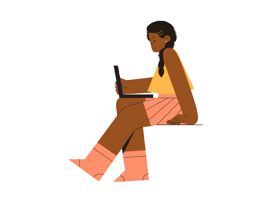
As a student myself, I’ve felt that isolation in both in-person and online learning. At a big school, it’s hard not to feel alone—whether you’re sitting in a crowded lecture hall or taking classes from behind a screen. For my user research, I conducted virtual interviews with three students and sent out surveys to over twenty students, yet only got eleven responses. One thing became clear—I wasn’t the only one feeling this way.
It became obvious that while everyone experiences college differently, one thing kept coming up: the desire for more meaningful connections. That made this project feel personal because I wanted to create a platform that ensures, no matter the situation, students can connect with their peers.
Rhea and Chris
Let's step into the shoes of
two students experiencing this challenge in different ways.
.png)
.png)
.png)
.png)
Why does any of this matter?
Being a student is hard, and it’s rarely the only thing going on in a student’s life. Juggling assignments, deadlines, and a social life is even more challenging in today’s fast-paced hybrid world. My research showed that many students are facing the same struggle. The problem isn’t just the workload—it’s that the tools they rely on aren’t designed for what they actually need, leaving them overwhelmed, disconnected, and frustrated.
so...
If students had a centralized, mobile friendly tool that seamlessly integrates academic and social life then they would feel more organized, connected, and in control.
.png)
.png)


Usability Evaluation
I conducted usability testing with five Rutgers students to evaluate whether RUConnected was heading in the right direction. Each participant navigated through the app, verbalizing their thoughts on what they liked and what they didn’t.
WAIT!
.png)
Want the Full Picture?
Use this Key!
Towards the end of this project, I found myself constantly noticing small improvements I could make to make it more user-friendly. But if I kept tweaking every detail, I’d never be able to move forward.
Instead of perfecting every element, I’ve left a note on the adjustments I’d make if I had more time—it's all part of the learning process.
Hover over the title to see the hidden details!
In A Rush? That's OK

Here is a Video of the Prototype in Action
or keep scrolling to view the results!
.png)
Onboarding
Not every student remembers their course PIN, so an easier way to connect their course schedule would make life a lot simpler.
.png)
.png)
Home
When students enter the home screen, their daily to-do list appears by default. They can collapse it to access the student feed, where they can interact with each other by viewing and sharing posts, seeing updates from organizations, and staying informed on school announcements.
.png)
Tasks
Course assignments automatically pop up on your daily to-do list, making it easy to jump into Canvas and get things done. You can also add work tasks manually to keep everything organized.
Students don’t want to manually add everything, so I’d create a simpler, more user-friendly design. They’d be able to quickly create planners, set custom notifications, and connect their Google, Microsoft, or other calendars—keeping everything in one place.
.png)
Chat
Students can chat with friends, create group chats, join organization chats, and get school-wide notifications—all in one place.
What about students who have trouble finding friends? I’d create recommendations for group chats or add more open chats based on interests to make it easier for them to connect.
.png)
Organizations
Students can join hybrid organizations, where both in-person and virtual members can interact through the app and receive alerts about upcoming events.
This needs a makeover— a more user-friendly interface that gives students easy access to information about organizations directly on the app, so they don’t have to request details. This would make it simpler for them to find ways to connect with each other.
.png)
Profile
On their profile, students can include a short bio to introduce themselves, showcase their skills and developing abilities, and see the courses they've completed, along with the ones left to finish their degree.
Students want to connect beyond school, so I’d include the option to link other social profiles like LinkedIn, Instagram.
.png)
Skills and Achievements
Students can add their skills and achievements to their profile and reflect on their growth throughout their degree.
When students add to their developing skills, it would be great if they were given learning modules on LinkedIn, helpful resources, or class recommendations to continue growing.
.png)
Friends
Students have a friend list where they can add new connections or view their friends' profiles.
Bad with names or searching for new connections? ‘People You May Know’ tab or ‘People With Similar Interests’ tabs can connect more people.
.png)
Search
When students go to search, they need better filter options and personalized recommendations to make finding what they need easier.
Thank you
for viewing my very first UX project!
This experience taught me the basics, but also showed me how valuable feedback can be in shaping the final outcome. I’m really grateful for all the input I’ve received along the way—it’s helped me get to this point.