LCFLS Brand Identity
Branding · Visual Identity · Community Systems
Public libraries are community anchors, but without a shared identity, their impact can feel fragmented. Before this project, the Lawrence County Federated Library System (LCFLS) had no unified logo or visual system connecting its three libraries and bookmobile.
This project focused on creating a warm, flexible brand identity that reflects the county’s history and community, while supporting future digital growth like a unified website and mobile experience.
Project Overview
TL;DR Edition
Team: Multidisciplinary externship team
Duration: 8 weeks
This project focused on creating a cohesive brand identity for the Lawrence County Federated Library System (LCFLS), unifying multiple libraries under one visual system while maintaining a warm, community-centered feel.
LCFLS served multiple libraries across the county but lacked a consistent visual identity, making it challenging to present the system as a unified organization across print and digital touch points.
Brand & Visual Designer
-
Contributed to brand concept development and visual direction
-
Explored and refined logo concepts leading to final selections
-
Helped translate brand decisions into real-world collateral
-
Brand research and visual exploration
-
Logo sketching and iterative design in Illustrator
-
Color palette and typography exploration
-
Applying the brand across collateral
Created a flexible, recognizable brand system that feels welcoming, trustworthy, and rooted in the community, allowing LCFLS to present a more unified and professional presence across touch points.
This project reinforced the importance of collaboration and iteration in brand design and showed how thoughtful visual systems support clarity, consistency, and long-term usability.
Now... To make a short story long
Project Overview
The Lawrence County Federated Library System (LCFLS) supports multiple libraries across the county, serving diverse communities through shared resources and programming. This project was completed through the Rutgers MBS Externship and focused on developing a cohesive brand identity that unifies the system while remaining welcoming and community-centered.
The work blended brand strategy, visual design, and collaboration to create a flexible identity system that supports clarity, consistency, and long-term usability across library touchpoints.
The Problem
While LCFLS operated as a connected system, its visual presence did not reflect that unity. Each library functioned with its own look and materials, making it challenging to communicate a shared identity across print and digital platforms.
Without a consistent brand system, LCFLS struggled to present itself as a single organization, limiting recognition, clarity, and cohesion for both internal teams and the communities they serve.
My Role
Collaborated with a multidisciplinary team through the Rutgers MBS Externship to develop a cohesive brand identity for a county-wide library system.
-
Contributed to brand research and concept development, exploring visual directions rooted in community and accessibility
-
Designed and refined logo explorations through sketching and iterative work in Illustrator
-
Helped define color palettes and supporting visual elements to create a warm, approachable brand system
-
Applied the brand across print and digital collateral to ensure consistency across touchpoints
-
Worked closely with teammates and stakeholders to align design decisions with real-world constraints
Tools Used
A mix of design, collaboration, and implementation tools used across research, exploration, and execution.
Key Contributions
Brand Research & Discovery –
Supported the early research phase by gathering insights on Lawrence County’s history, local symbols, community values, and partner needs. This groundwork helped identify themes of accessibility, unity, and heritage that informed the overall brand direction.
Impact: Established a strong, community-informed foundation for a brand identity that felt authentic, welcoming, and rooted in place.
Logo Concept & Visual Exploration –
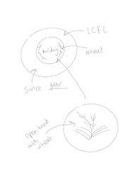
Assisted with brainstorming, sketching, and iterative refinement of logo concepts inspired by courthouse architecture, books, and agricultural symbolism. I helped evaluate which visual elements best represented the system’s mission and values.
Impact: Delivered a recognizable seal and logo that balanced historical meaning with modern clarity, connecting all three libraries and the Bookmobile.
Tone, Typography & Color Development –
Contributed to shaping the brand’s tone of voice, selecting typefaces, and defining color palettes inspired by the county flag and traditional library aesthetics, with a focus on warmth, trust, and educational purpose.
Impact: Created a cohesive visual system that translated across print and digital touch points, giving LCFLS a unified, professional presence.
Print & Digital Mockups –
Using Adobe tools and Canva, designed mockups for business cards, rack cards, promotional materials, and style guide sections, including layouts for the Bookmobile brochure.
Impact: Helped partners visualize real-world application, making the brand feel tangible and implementation-ready.
Style Guide Drafting & System Building –
Contributed to writing, organizing, and refining the visual style guide, including logo usage rules, typography hierarchy, color ratios, and brand applications across print and social media.
Impact: Delivered a scalable brand foundation to support future digital tools, marketing materials, and system-wide consistency.

_edited.png)


Thank You
For viewing my work on the LCFLS brand identity!
This project showed me how meaningful design becomes when it reflects real people, real history, and real communities. Building a brand system from the ground up taught me how to translate research into visual storytelling, shaping colors, typography, and symbols that honor local heritage while still feeling modern and welcoming.
Throughout the process, I strengthened hands-on skills in brand development, visual design, collaboration, and style-guide creation. Working with a multidisciplinary team helped me learn how to communicate design decisions clearly and iterate based on shared goals.
Designing for diverse audiences, families, seniors, children, and longtime patrons reinforced how consistency, accessibility, and warmth work together to create a unified brand experience. Seeing the system come to life across brochures, templates, and a complete style guide was incredibly rewarding and reaffirmed why I love mission-driven design.
.png)


