.png)

RUConnected
UX/UI Case Study · Mobile App · Student Experience
College life can feel overwhelming, with deadlines, meetings, assignments, and events all fighting for attention. Between staying on top of classes and finding time for community, it’s easy to miss opportunities.
RUConnected aims to bring these pieces together, helping Rutgers students feel more connected, organized, and supported.
Project Overview
TL;DR Edition
Team: Group project
Duration: 12 weeks
RUConnected is a concept app designed to help Rutgers students stay organized, connected, and supported by bringing academic tools, campus resources, and peer support into one intuitive experience.
Rutgers students rely on multiple disconnected platforms to manage classes, schedules, resources, and campus life, making it difficult to stay organized and find support when they need it.
UX/UI Designer
-
Led user research, wireframing, and high-fidelity prototyping
-
Conducted usability testing to refine the app’s flow, clarity, and accessibility
-
User research & persona development
-
Information architecture and task flows
-
Wireframes → high-fidelity prototypes
-
Usability testing and iterative refinements
Designed a centralized, student-focused app experience that simplifies navigation, improves access to campus resources, and supports both academic and social needs.
This project reinforced the importance of designing around real student behaviors, not assumptions, and showed how iterative testing can quickly surface usability issues that impact clarity, trust, and engagement.
Now... To make a short story long

As my first UX project, I had the opportunity to explore every stage of the design process.
Here’s an inside look…
Project Overview
RUConnected was designed to help Rutgers students feel more organized, connected, and supported throughout their academic journey. Rather than relying on scattered platforms for schedules, resources, and campus support, the app brings everything into one centralized, student-first experience.
By combining academic tools, campus resources, and peer connection features, RUConnected aims to reduce overwhelm and make it easier for students to find the information and support they need, when they need it.
This project blends UX research, information architecture, and UI design to create a clear, approachable app experience rooted in real student needs and behaviors.
The Problem
Rutgers students rely on multiple disconnected platforms to manage their academic lives, including class schedules, assignments, campus resources, and social opportunities.
As a result, students often feel overwhelmed, disorganized, and unsure where to turn for support. Important information can be challenging to find, peer connections are fragmented, and opportunities to engage with campus life are easily missed.
This lack of a centralized, student-focused experience makes it harder for students to stay on top of their responsibilities and feel supported throughout their academic journey.
My Role
Collaborated with a student team to design and prototype a student-centered mobile app, contributing across the process from research to high-fidelity designs.
-
User research including interviews and surveys, to understand student needs and pain points
-
Information architecture and task flows to support clear, intuitive navigation across key student tasks
-
Wireframes and high-fidelity prototypes that translated research insights into usable solutions
-
Usability testing and iteration based on user feedback
Tools Used
Used throughout research, prototyping, testing, and presentation.
Figma
Miro
Google Forms
Canva
The Process
Understanding the Student Experience

The college experience is supposed to feel social, vibrant, and alive, but for many students, it doesn’t always feel that way.
In a lecture hall packed with hundreds of people, students shared that they often felt invisible, overwhelmed, or disconnected. Meanwhile, others learning from home appreciated the flexibility but shared how isolating it could be.
Two completely different environments.
One shared emotion: disconnection.
Research Methods

.png)
Why This Matters
Students are constantly switching between apps, such as Canvas for class updates, Google for reminders, and GroupMe or WhatsApp for communicating with peers. This creates friction and makes it harder to feel a sense of connection. This analysis confirmed the need for an integrated tool designed around the real rhythm of student life.
To bring the research to life, I translated my findings into two student personas each representing a different path through college.
.png)

-
Students want real-time notifications that don’t get buried
-
Students want fewer tools, not more features
-
Students value a connection that feels natural, not forced
If students had a mobile-friendly, centralized space where academic and social life worked together, then staying engaged would feel easier, helping them feel more organized, connected, and in control.
Guided by these insights, I began visualizing possible solutions
My First Round of Sketches
I started by sketching out the essential features students said they needed most:
task management, schedules, clubs, chat, and notifications.
_edited.png)
Information Architecture
With early ideas on paper, I mapped out how everything would connect.
The goal was to make the app intuitive and easy to navigate.
_edited.png)
Low-Fidelity Wireframes
This phase helped me visualize structure and identify what screens mattered most, while strengthening my Figma skills through experimenting with layout grids, spacing systems, visual hierarchy, typography, and early component patterns.


Usability Evaluation
I conducted usability testing with five Rutgers students to evaluate whether RUConnected was on the right track. Each participant navigated the prototype, verbalizing their thoughts on what they liked and didn’t.
WAIT!
.png)
Want the Full Picture?
Use this Key!
Towards the end of this project, I found myself constantly noticing small improvements I could make to make it more user-friendly. But if I kept tweaking every detail, I’d never be able to move forward.
Instead of perfecting every element, I’ve left a note on the adjustments I’d make if I had more time, it's all part of the learning process.
Hover over the title to see the hidden details!
In A Rush? That's OK

Here is a Video of the Prototype in Action
or keep scrolling to view the results!
Introducing RUConnected
Your all-in-one student space.
.png)
Onboarding
Not every student remembers their course PIN, so an easier way to connect their course schedule would make life a lot simpler.
.png)
_edited.png)
Home
When students enter the home screen, their daily to-do list appears by default. They can collapse it to access the student feed, where they can interact with each other by viewing and sharing posts, seeing updates from organizations, and staying informed on school announcements.
.png)
Tasks
Course assignments automatically pop up on your daily to-do list, making it easy to jump into Canvas and get things done. You can also add work tasks manually to keep everything organized.
Students don’t want to add everything manually, so I’d create a simpler, more user-friendly design. They’d be able to quickly develop planners, set custom notifications, and connect their Google, Microsoft, or other calendars, keeping everything in one place.
_edited.png)
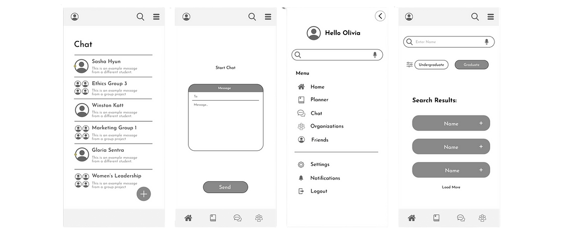
Chat
Students can chat with friends, create group chats, join organization chats, and get school-wide notifications, all in one place.
What about students who have trouble finding friends? I’d create recommendations for group chats or add more open chats based on interests to make it easier for them to connect.
_edited.png)
Organizations
Students can join hybrid organizations, where both in-person and virtual members can interact through the app and receive alerts about upcoming events.
This needs a makeover, a more user-friendly interface that gives students easy access to information about organizations directly on the app, so they don’t have to request details. This would make it easier for them to connect.
.png)
Profile
On their profile, students can include a short bio to introduce themselves, showcase their skills and developing abilities, and view the courses they've completed, along with those left to finish their degree.
Students want to connect beyond school, so I’d include the option to link other social profiles like LinkedIn and Instagram.
.png)
Skills and Achievements
Students can add their skills and achievements to their profile and reflect on their growth throughout their degree.
When students build on their developing skills, it would be great if they were given LinkedIn learning modules, helpful resources, or class recommendations to continue growing.
_edited.png)
Friends
Students have a friend list where they can add new connections or view their friends' profiles.
Bad with names or searching for new connections? The ‘People You May Know’ tab or the ‘People With Similar Interests’ tab can connect more people.
Search
When students search, they need better filtering options and personalized recommendations to make finding what they need easier.
.png)
Thank You
For viewing RUConnected!
This project marked a turning point in my UX journey. RUConnected was where everything truly came together, from UI design and layout decisions to information architecture, usability testing, and iteration based on honest user feedback. It challenged me to move beyond “what looks good” and focus on why design decisions matter and how they directly impact usability.
Working through research, wireframing, prototyping, and testing helped me understand how thoughtful design choices can reduce friction, support clarity, and guide users toward confident decision-making. I learned how to balance visual design with functionality, translate feedback into meaningful improvements, and refine ideas through multiple rounds of iteration.
More than anything, RUConnected taught me how robust user-centered design can be when it’s grounded in empathy, collaboration, and testing. This project laid the foundation for my UX skill set and shaped how I now approach every design challenge with curiosity, intention, and a willingness to learn.